PUNKOUT RECORDS
PunkOut Records serves up-and-coming artists’ recording, marketing, and copyrighting needs. It prides itself on its ability to sell the flashy and trendy aesthetics of punk to the masses.
But PunkOut Records isn’t just about the music; it’s a lifestyle brand. PunkOut Records is well known in the local scene, since it is the label that many D.I.Y. bands consider the local “sell out” record label.
.


TARGET AUDIENCE
PunkOut Records appeals to both recording artists and music enjoyers alike. Within any alternative music scene, the youngest bands are the most likely to sign with PunkOut Records.
With a younger demographic of recording artists brings many young fans. High schoolers in the local area that are interested in music, live concerts, and social media platforms would find PunkOut Records very appealing to follow and support.
BUSINESS PERSONALITY
Bold
Flashy
Edgy
Alternative
Confident
Assertive
Eccentric
Rebellious
Gritty
Energetic
Flashy
Edgy
Alternative
Confident
Assertive
Eccentric
Rebellious
Gritty
Energetic
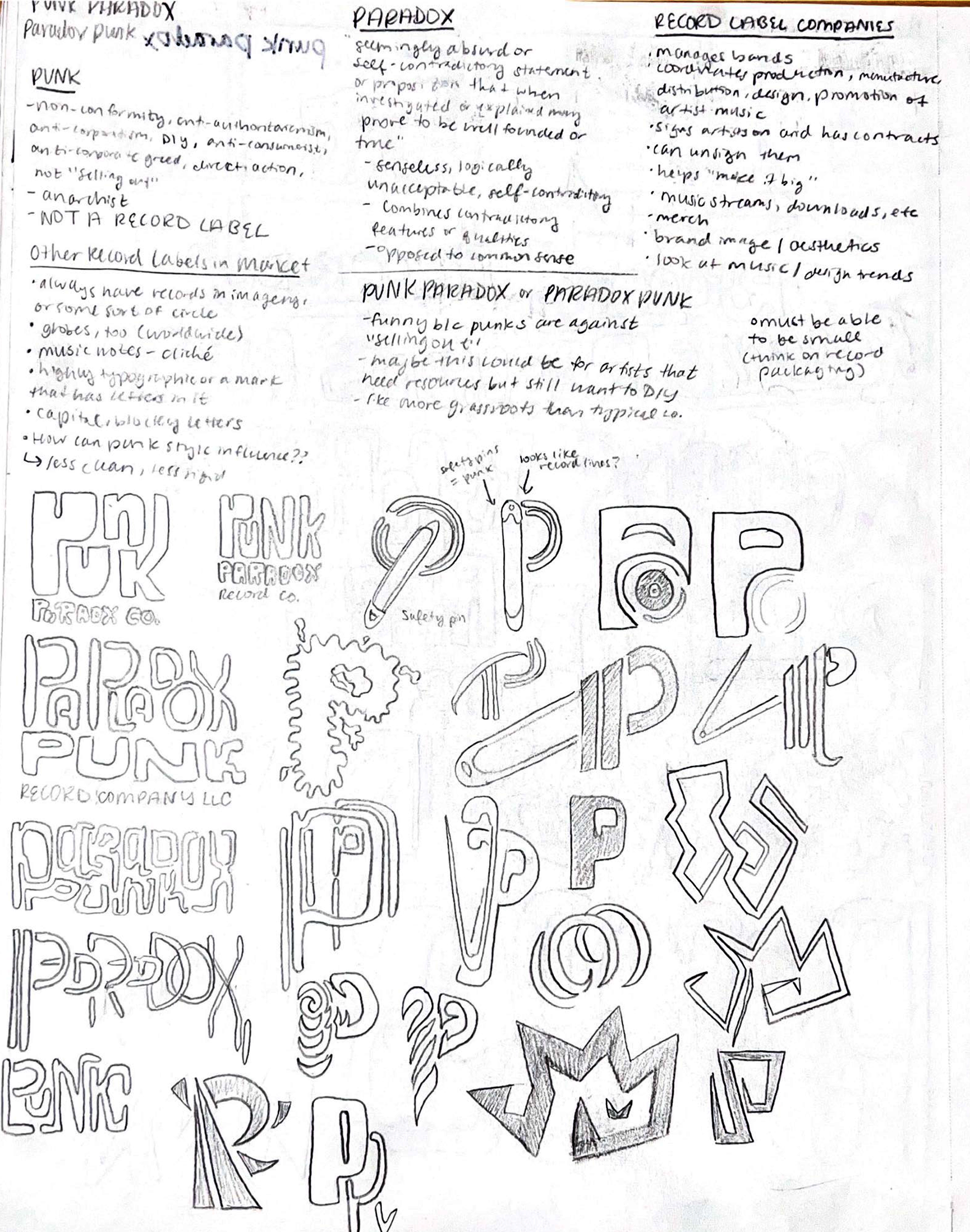
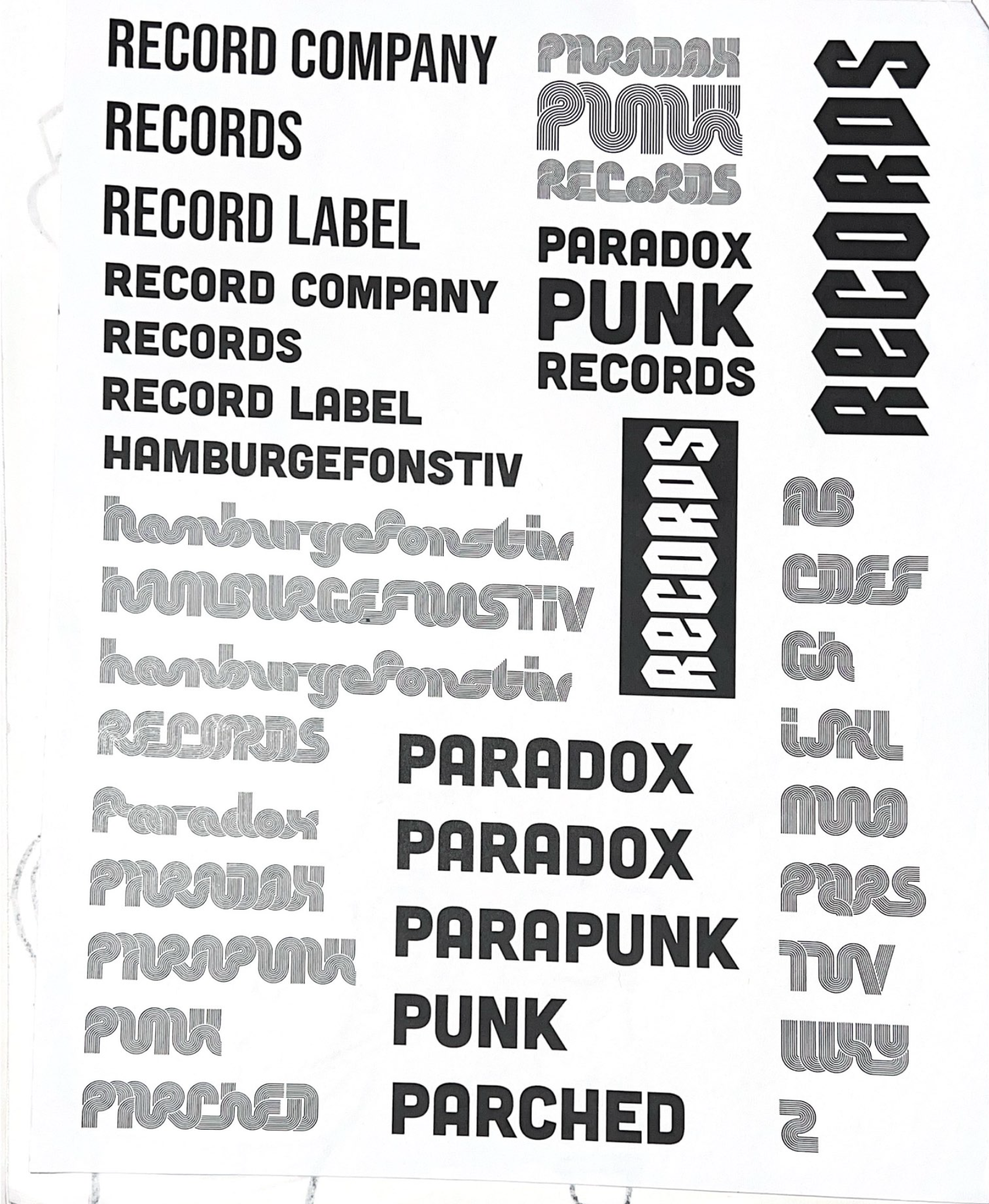
POTENTIAL NAMES
Paradox Records
Punkadox Records
Parapunk Records
Paradox Punk Records
Crimsin Records
SharpEnd Records
Mosh Records
Posh Mosh Records
Im Perfection Records
Parched Records
OutPunk Records
PunkOut Records
Paradox Records
Punkadox Records
Parapunk Records
Paradox Punk Records
Crimsin Records
SharpEnd Records
Mosh Records
Posh Mosh Records
Im Perfection Records
Parched Records
OutPunk Records
PunkOut Records

TYPE CHOICES
Shuriken Boy is the typeface of the main logotype and mark. Its unique cutouts and irregular letterforms capture the edginess and bold nature of a punk label.
Cubano Sharp is used as the subtext. Its blocky, solid forms communicate any message with strength.

LOGO IDEATION
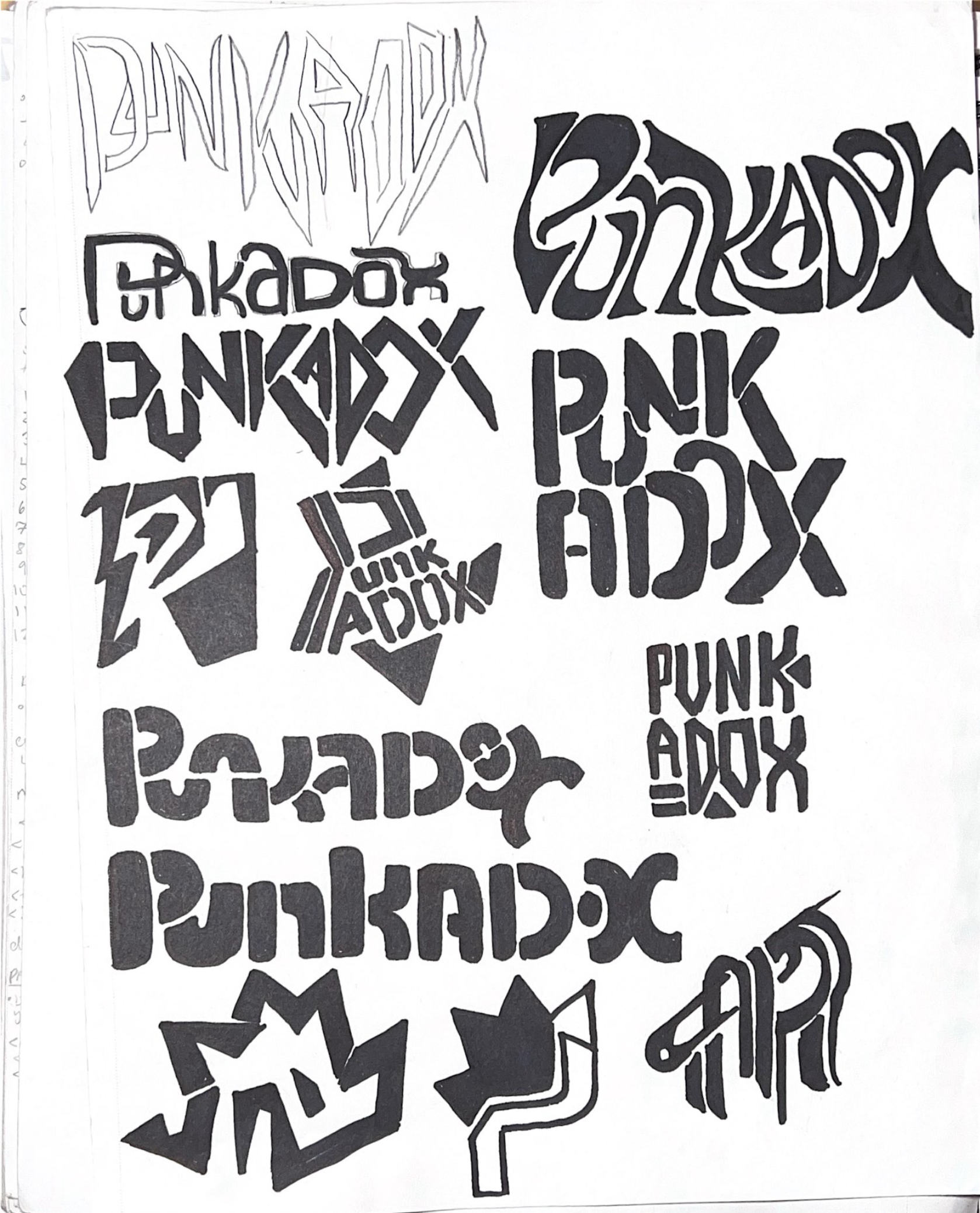

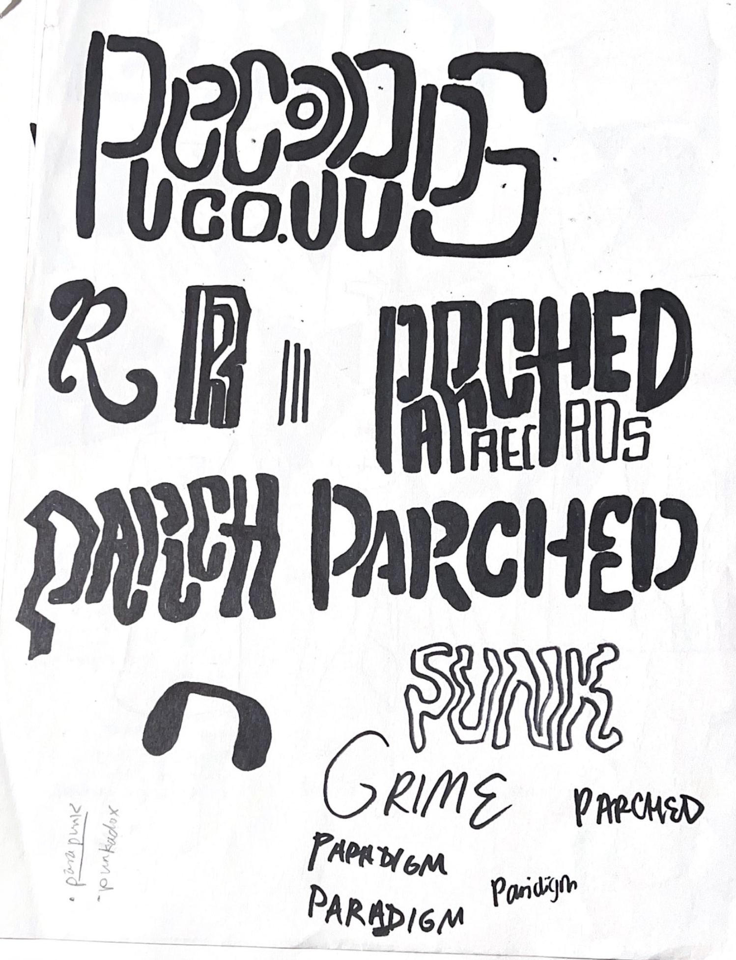
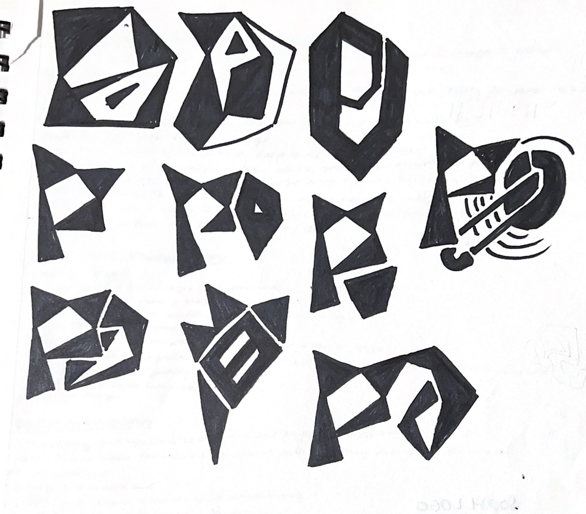

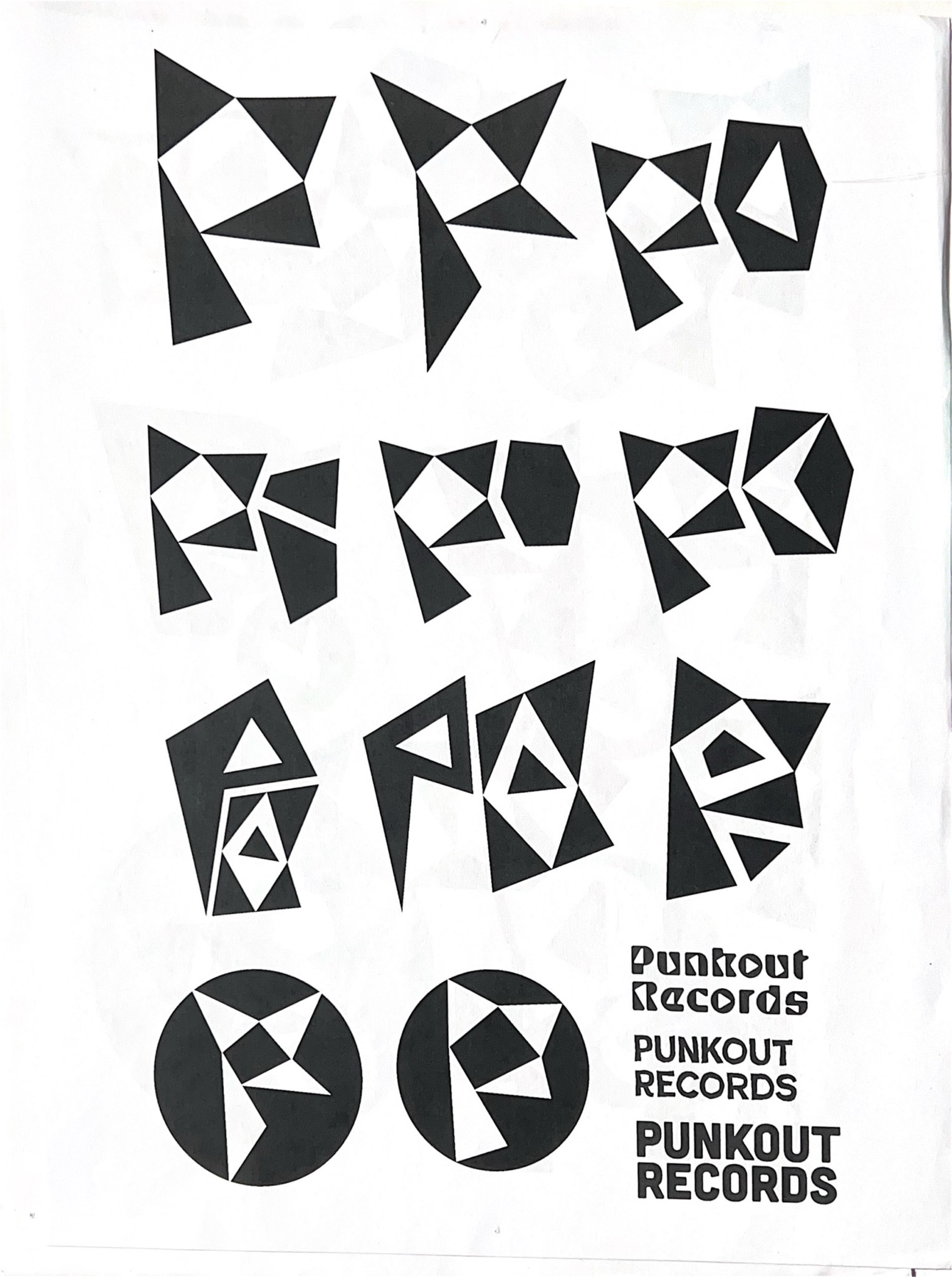
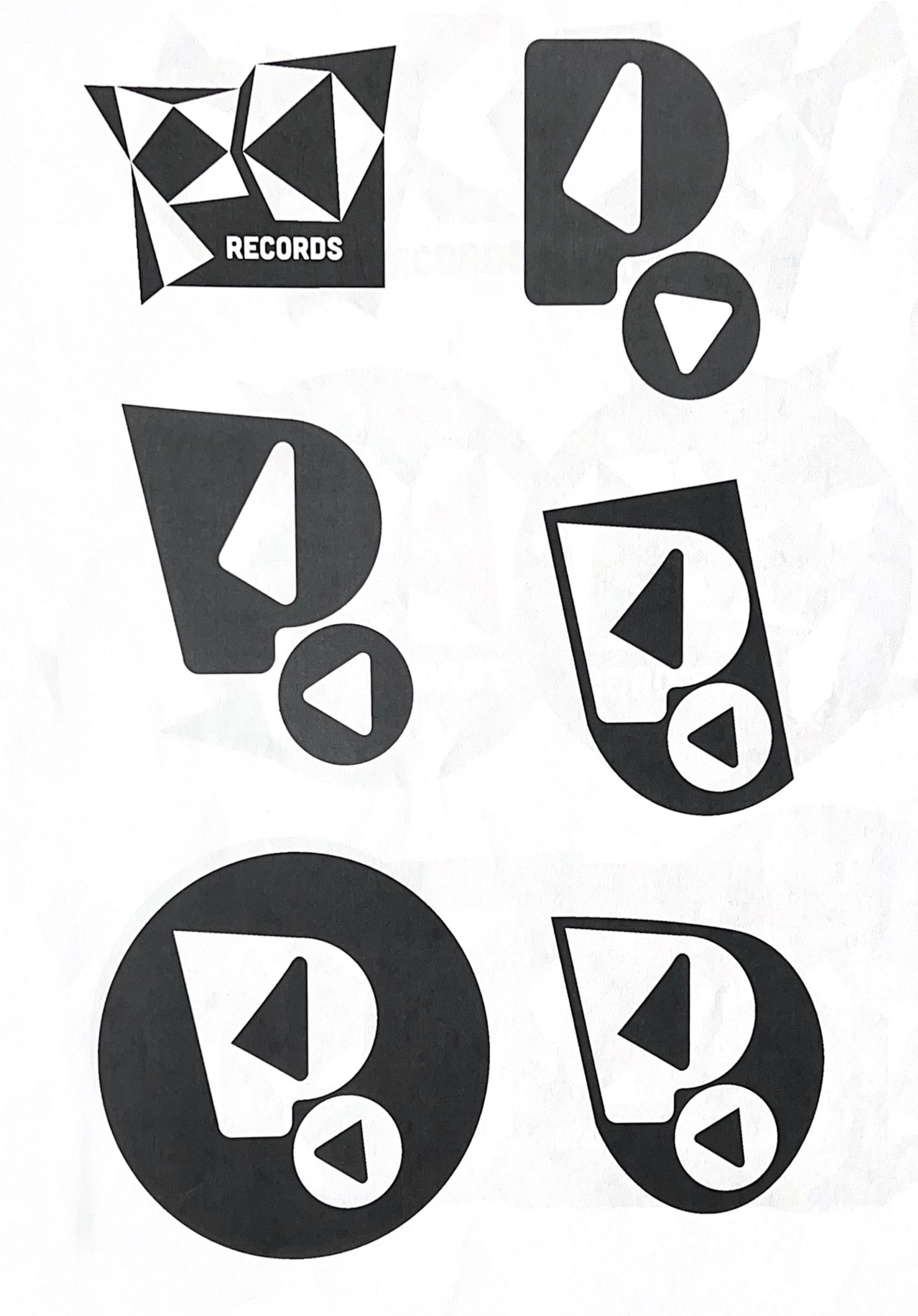
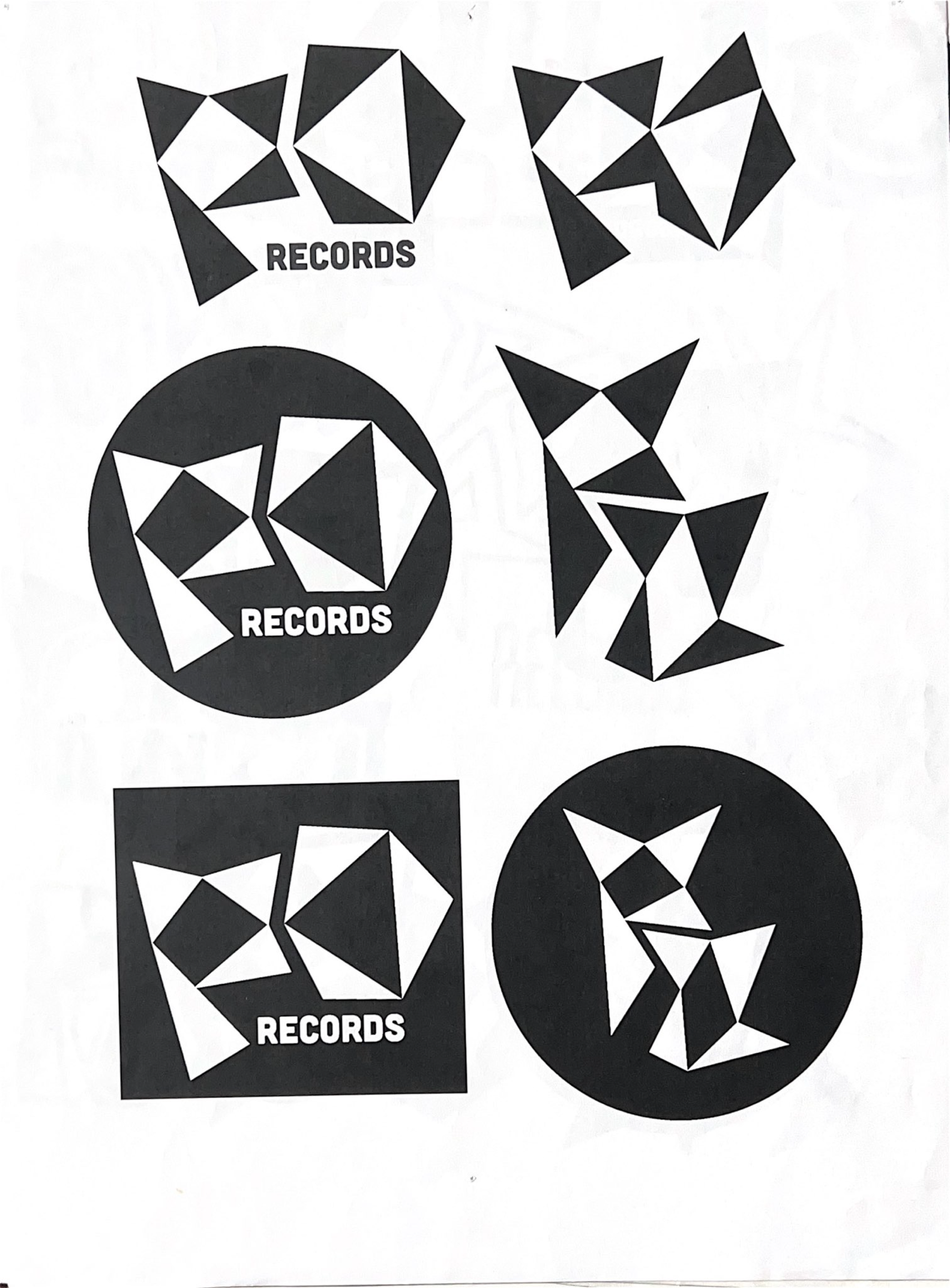
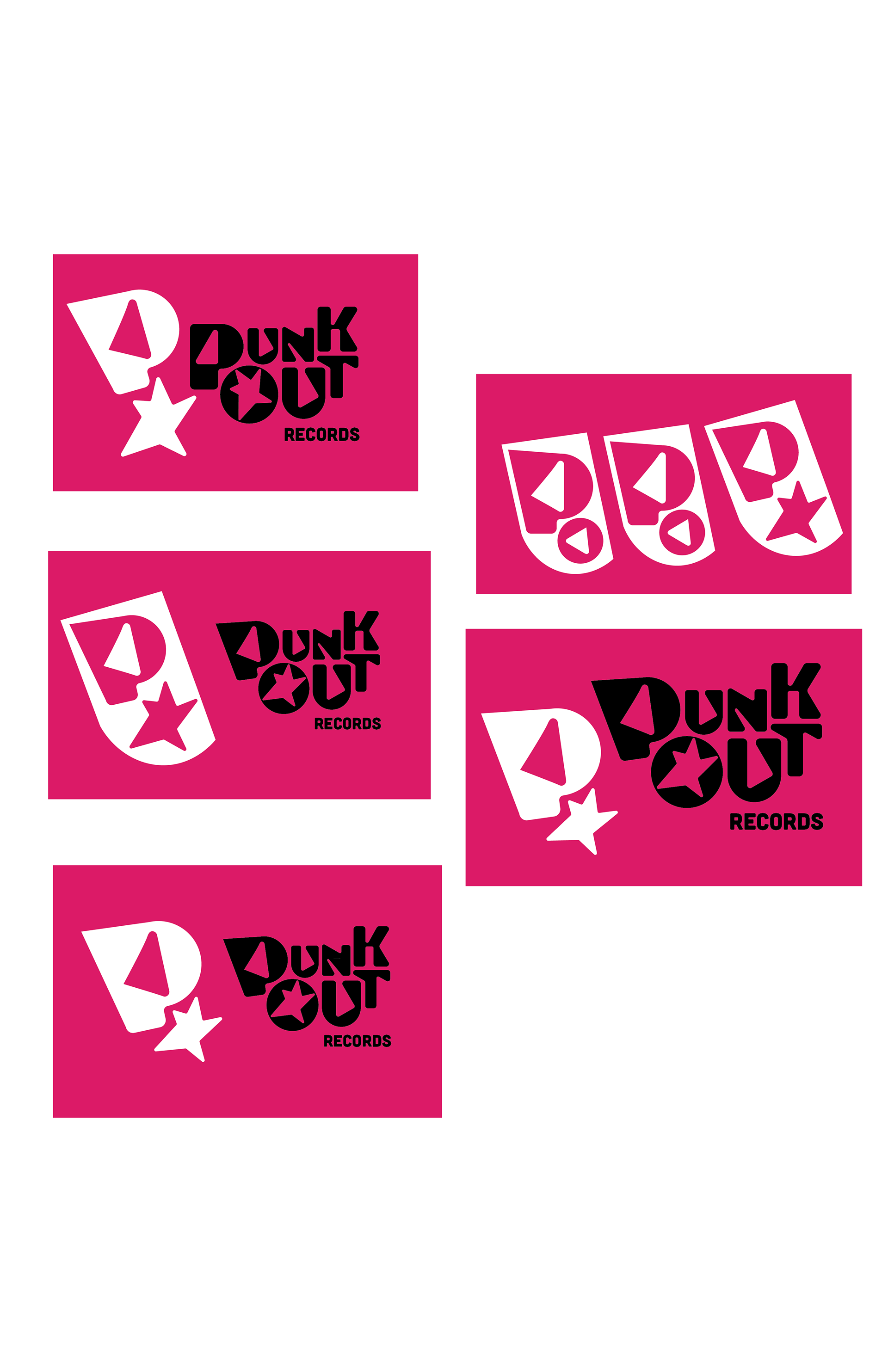
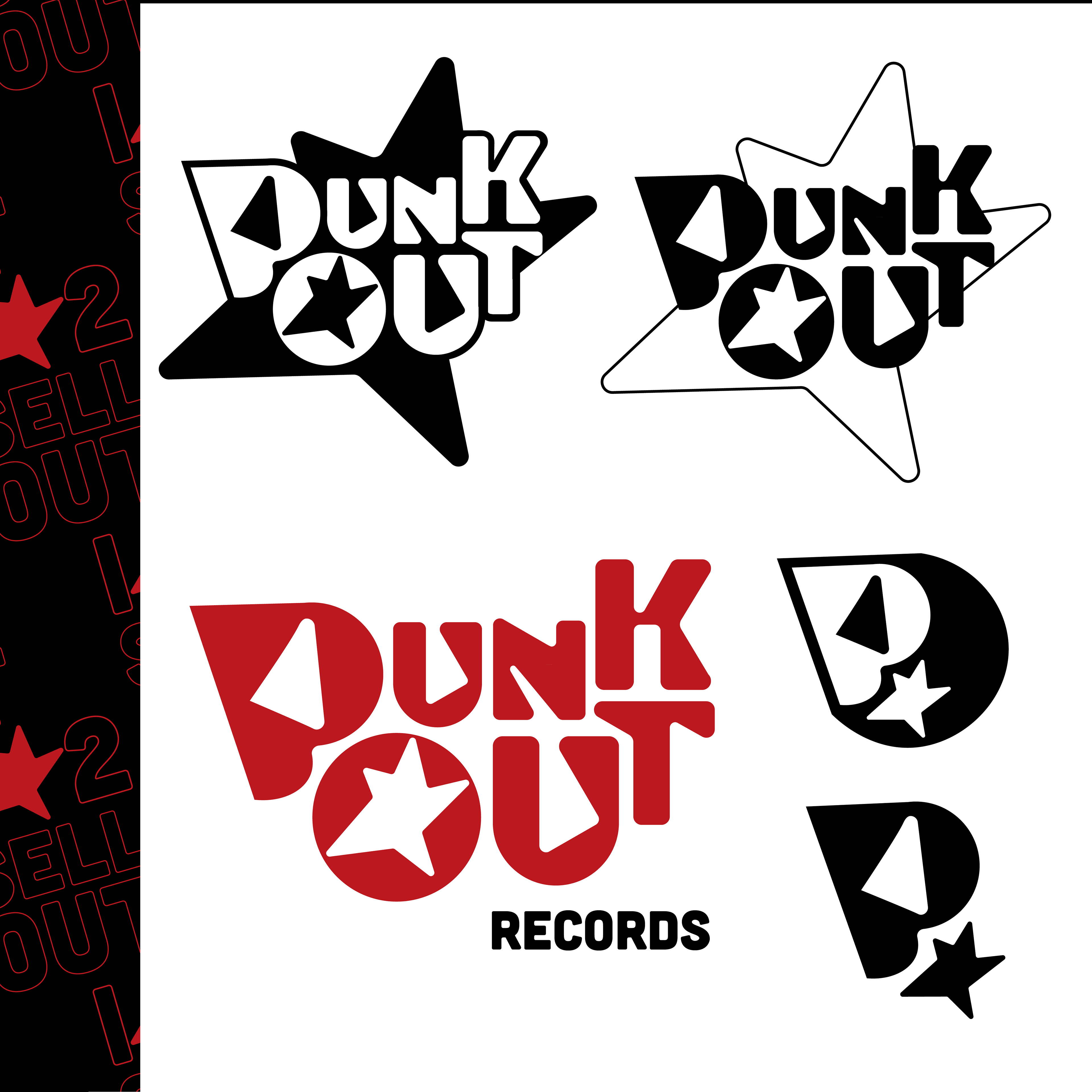
FIRST DRAFTS
I began to settle on a "P" form that incorporated an "O" in a sharp enclosure. I originally chose hot pink, black, and yellow to represent the energy of punk music, however I ended up discarding this palette later on in my process. I noticed that my typeface needed adjusting, specifically to sharpen and intensify the letterforms.
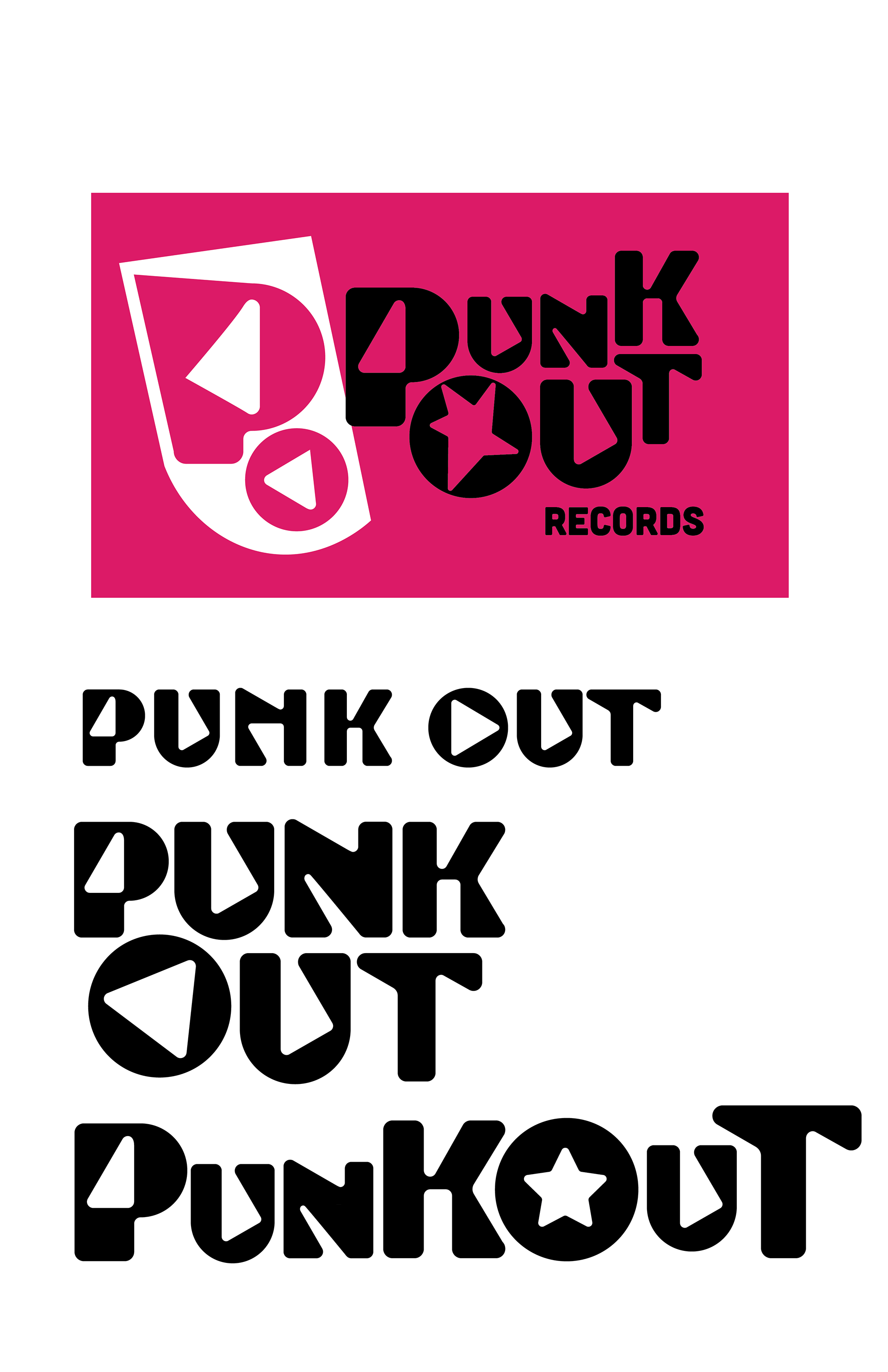

COLOR PALETTE
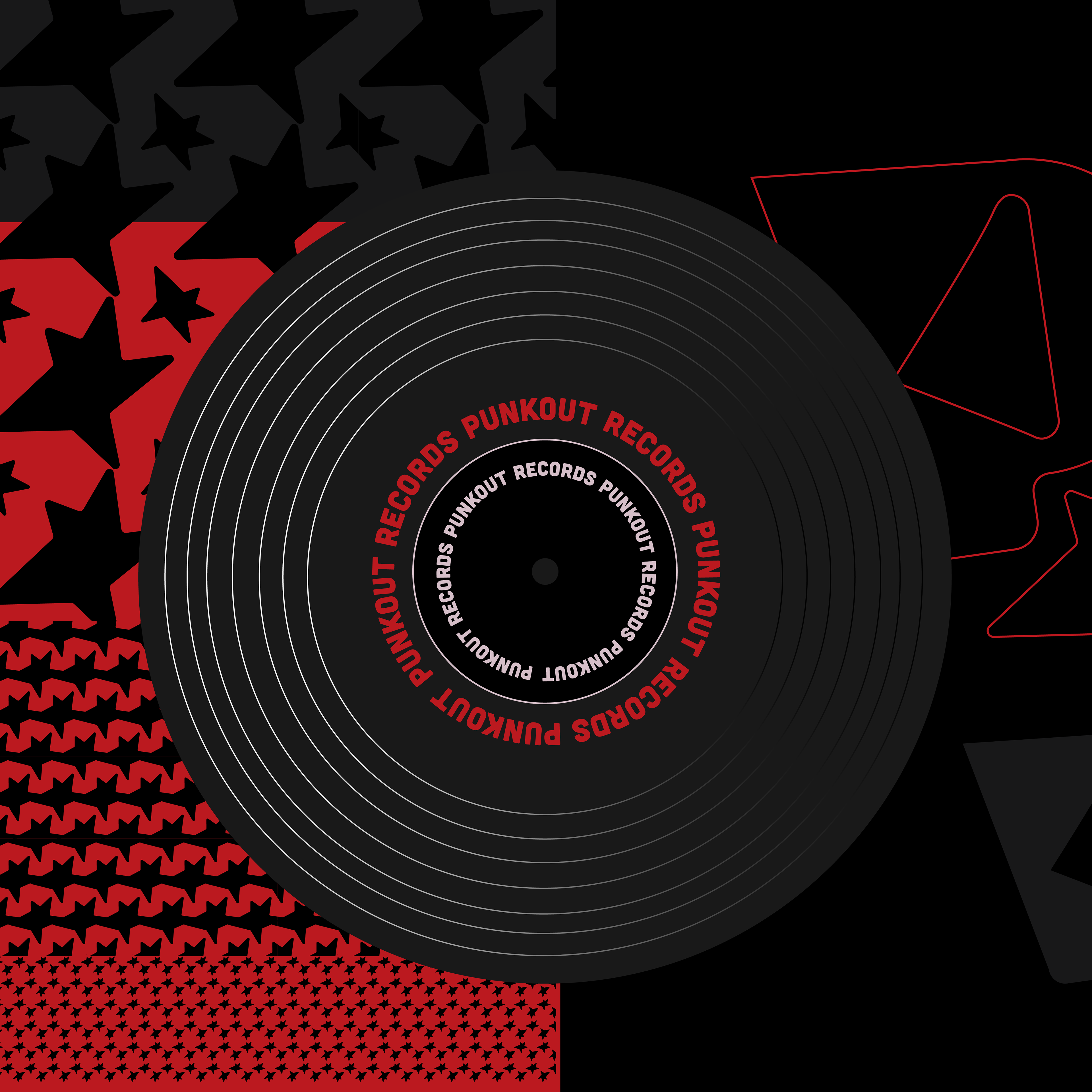
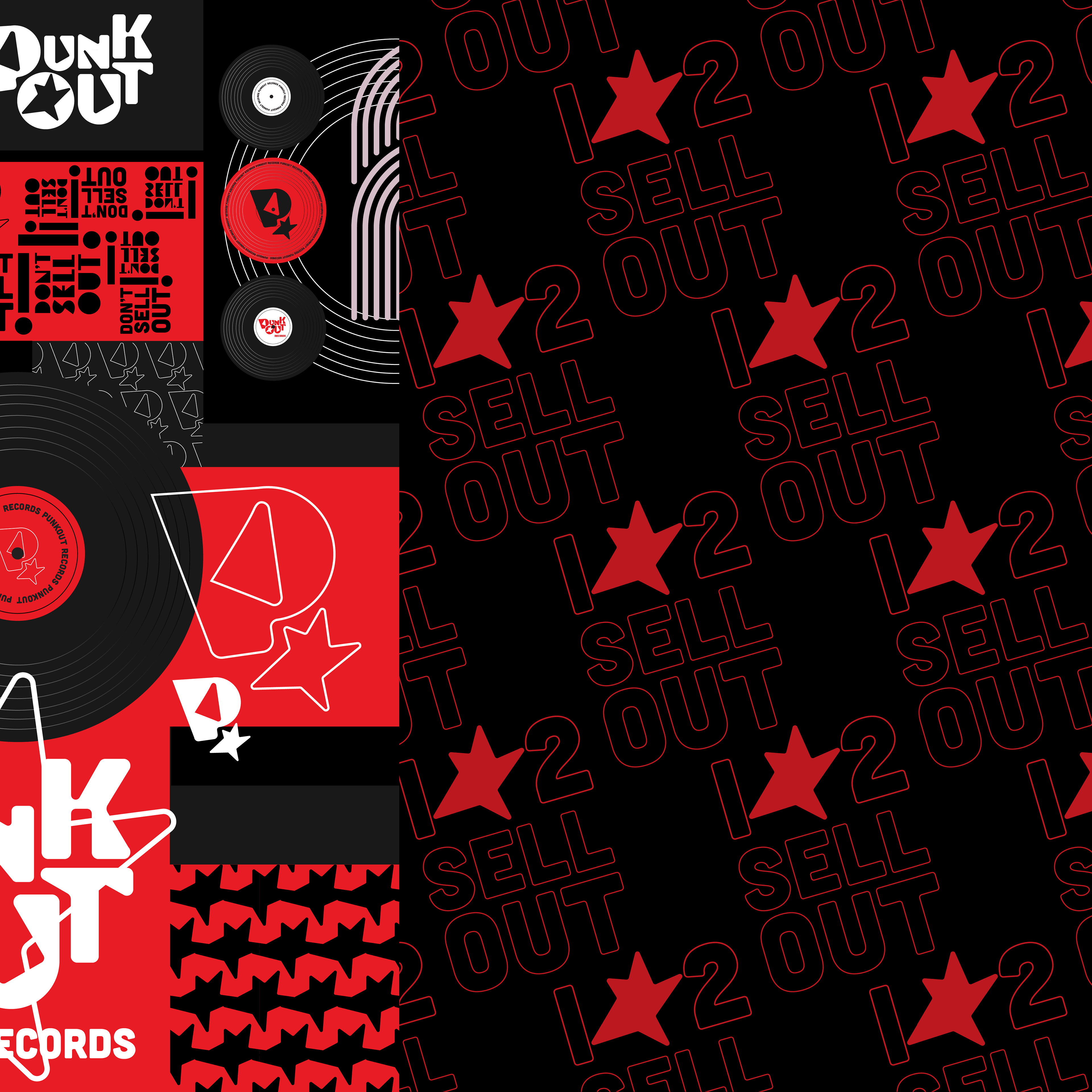
This revised color palette combines deep gray and black with a light warm gray for ultimate contrast.
The selective use of red packs a punch and a bold look to complement a punk label.
The selective use of red packs a punch and a bold look to complement a punk label.

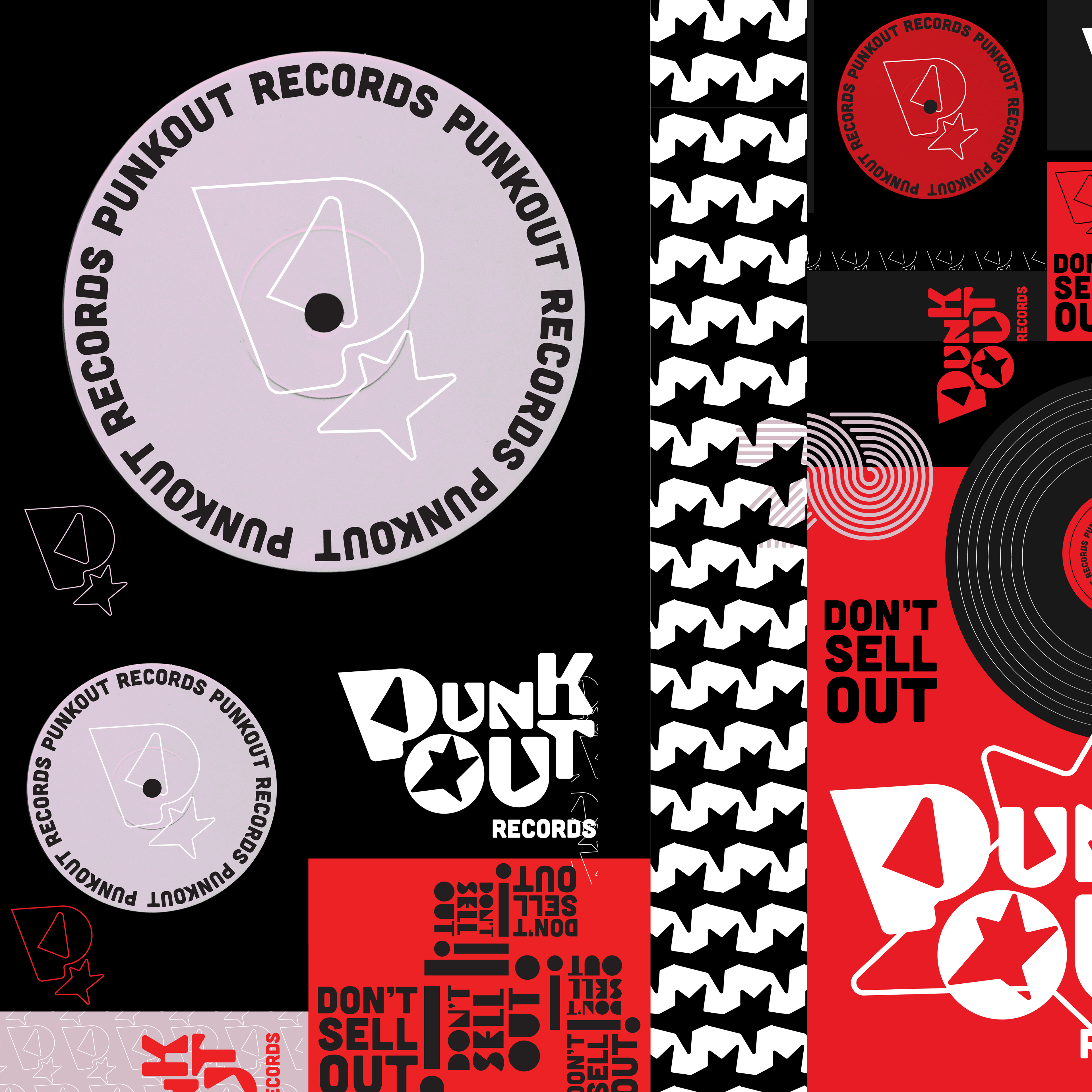
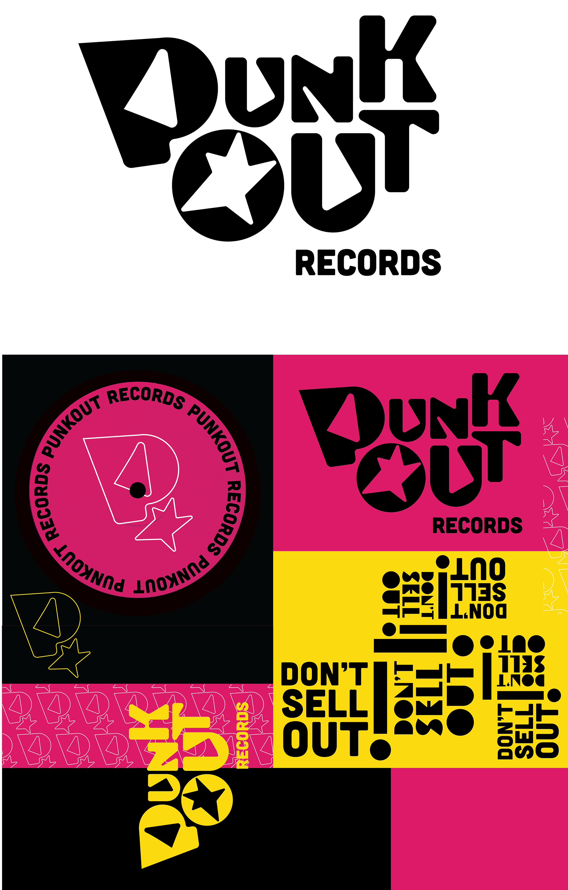
FINAL LOGO
By nesting each letter in a dynamic manner, I created a logotype that was systematic with the "P" icon. I adjusted the bottom of the large "P" to be rounded, which created more cohesion across my design.
I designed variations to the logo for ultimate versatility.


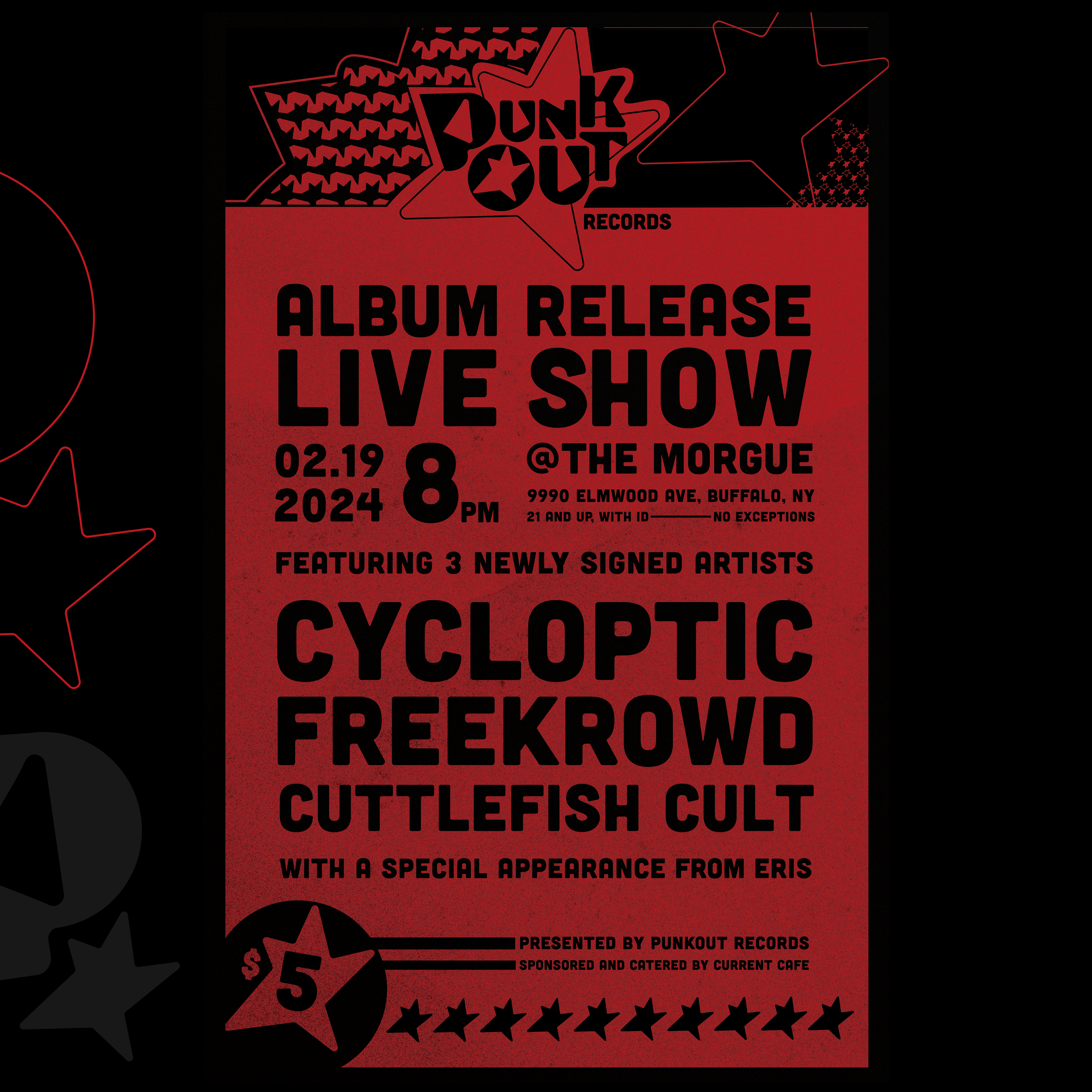
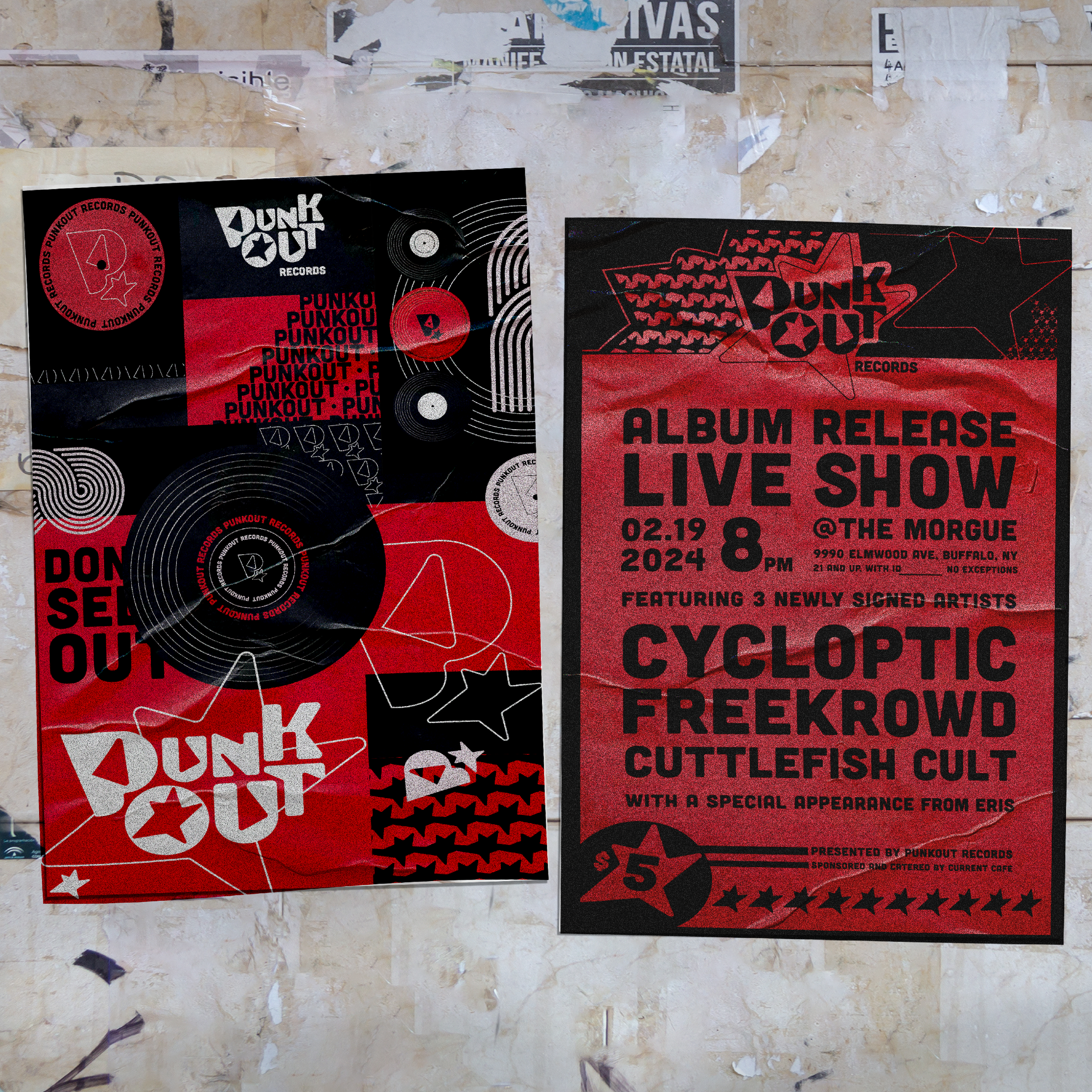
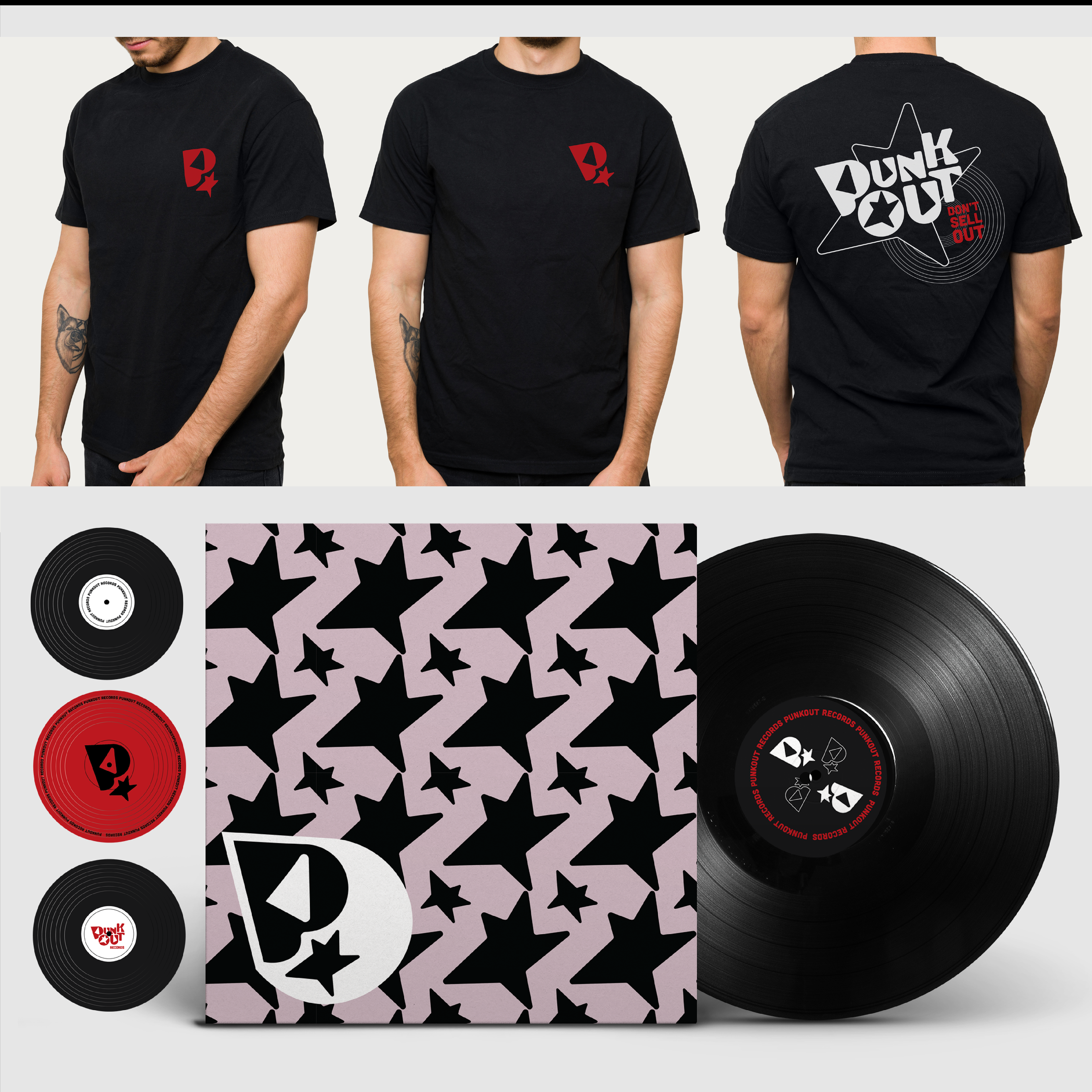
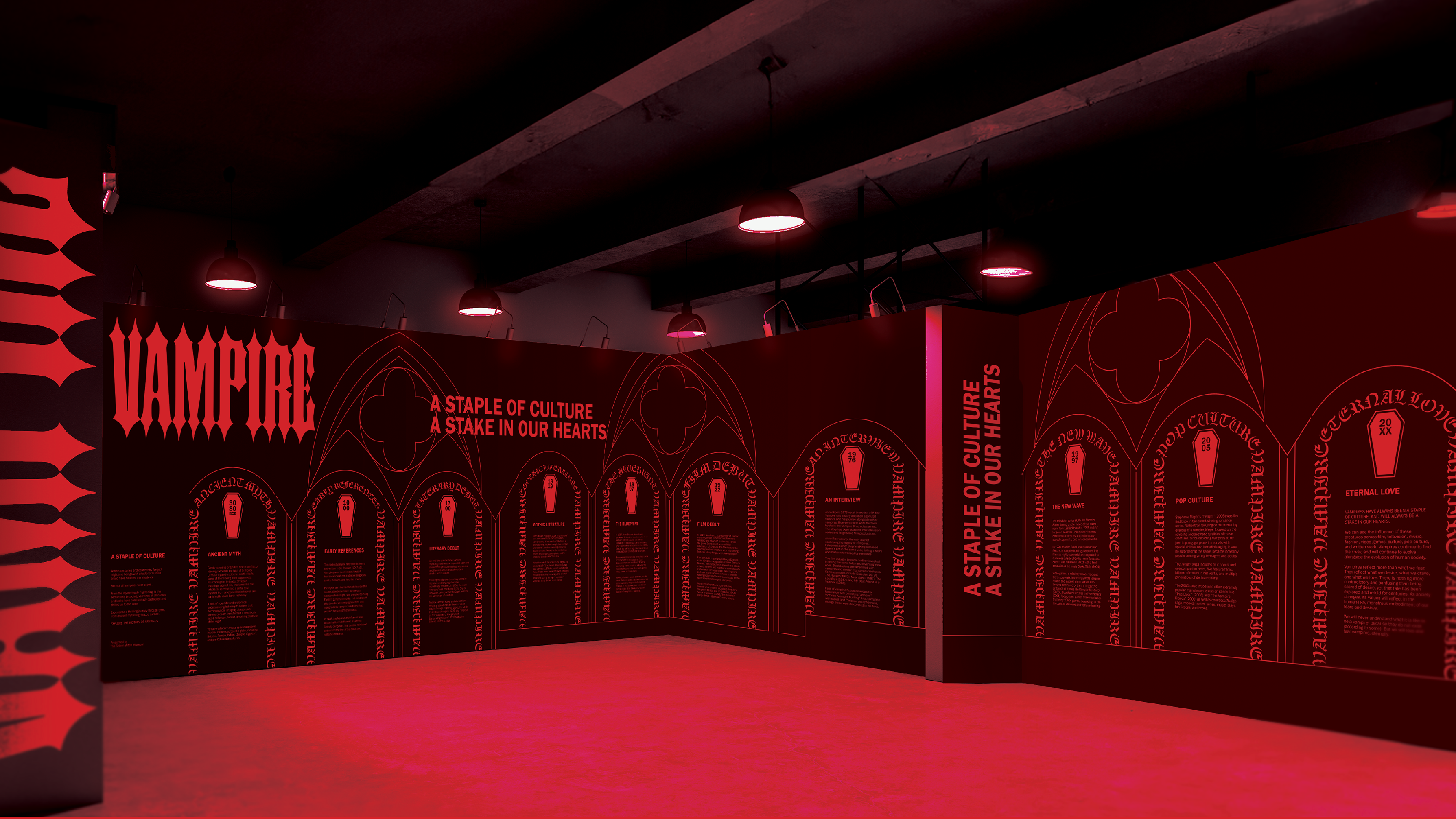
APPLICATIONS
I applied my logo to record packaging, t-shirts, and promotional posters. These items would be sold at live music shows, promotional events, and online.